Atelvia documentation
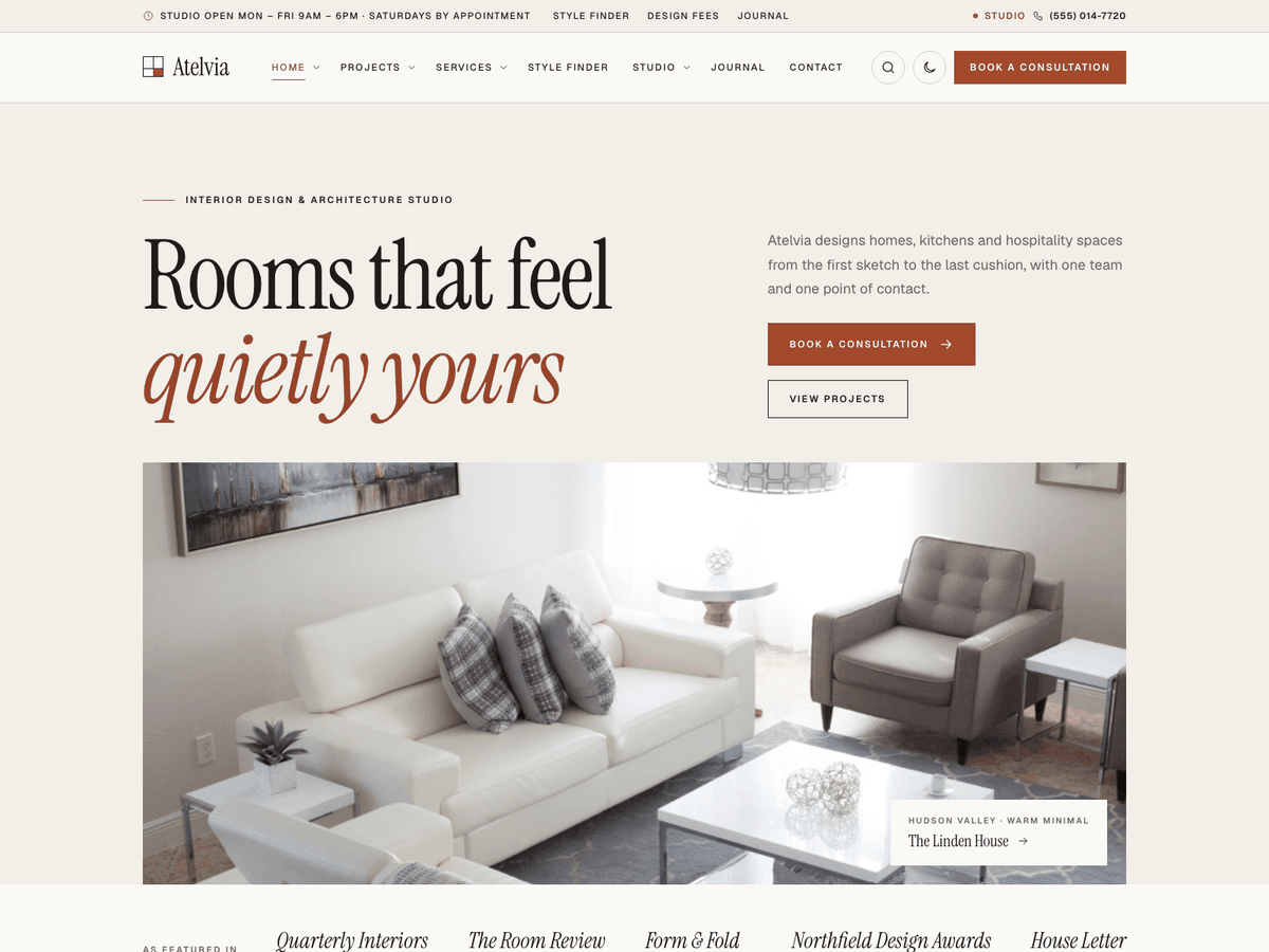
A WordPress theme for interior designers and architecture studios. Six demos, a filterable project portfolio by room and style, case studies with a materials palette and a full-screen gallery, a style finder, services with design fees, design process steps, a press and awards strip and a consultation booking form saved in your dashboard.
Thank you for choosing Atelvia. This guide takes you from a fresh WordPress site to a copy of the demo with your own details. If something is not covered here, write to support@codememory.com — we answer within one working day.
- Version1.0.0
- WordPress6.5 or later
- PHP7.4 or later
- Live demoOpen the demo
Highlights
- Six interior design demos imported in one click
- Project portfolio with filter buttons by room and by style
- Case-study pages: key facts, materials palette, full-screen photo gallery and project phases
- Style finder: room, palette and feeling point visitors to one of your styles
- Consultation booking form with meeting type, date, time slot and a guide design fee
- Hero planner bar: service, room and budget, sent to your consultation page
- Services with a design fee per sq ft or per room, timeline and what is included
- Design process steps, press and awards strip, stats and reviews
- Team profiles with role, training, specialty and their latest projects
- Design fee and package tables
- Studio hours with an "Open now" badge
- 18 Elementor widgets (free Elementor)
- Every section also works as a shortcode
- Call / consultation bar on phones
- Light and dark mode, and a dark architecture demo
- Colours and fonts from the Customizer
- Block patterns and every core block styled
- Self-hosted fonts, nothing loaded from Google
- Translation ready, right-to-left support
- Child theme included
What is in the download
themeforest-atelvia-wordpress-theme/
├── atelvia.zip               ← the theme: upload this in WordPress
├── atelvia-child.zip         ← child theme, for your own code changes (optional)
├── plugins/atelvia-core.zip  ← the theme's plugin (also installed from inside the theme)
├── demo-content/             ← demo files for a manual import
├── documentation/            ← this guide, as HTML and PDF
└── licensing/                ← GPL licence, font licences and credits
atelvia.zip, not the whole download. Uploading the download zip gives the error
"The package could not be installed. The theme is missing the style.css stylesheet."Requirements
- WordPress 6.5 or later (tested up to 7.1).
- PHP 7.4 or later (8.2 or later recommended).
- For the demo import: PHP
memory_limit256M,max_execution_time300, upload size 32M. Most hosts already allow this; if an import stops half-way, ask your host to raise these values.
Every plugin the theme uses is free from wordpress.org. Nothing needs a paid licence.
Installing the theme
- In your dashboard, go to Appearance → Themes → Add New Theme → Upload Theme.
- Choose
atelvia.zipand click Install Now, then Activate. - Optional: install and activate
atelvia-child.zipthe same way (see Child theme).
Upload by FTP instead: unzip atelvia.zip and copy the atelvia folder to
wp-content/themes/, then activate it under Appearance → Themes.
Plugins
After activation, a notice at the top of the dashboard lists the plugins the theme uses. Click Begin installing plugins (or go to Appearance → Install Plugins), select them all, choose Install, then activate them.
| Plugin | What it adds | |
|---|---|---|
| Atelvia Core | Required | Services, projects, team, rooms, styles, reviews, consultation form, style finder, studio hours, widgets, shortcodes and the demo import. Included with the theme. |
| Elementor | Recommended | The free page builder used for the demo pages. The theme's own widgets appear in Elementor's Atelvia group. |
| One Click Demo Import | Recommended | Imports a demo in one click. You can remove it after the import. |
The theme works without any plugin: posts, pages, menus, widgets and search are styled the same. The plugin is needed for the studio features (services, projects, team, style finder, consultation form…).
Importing a demo
The import gives you the demo site: pages, services, projects with their galleries, team members, reviews, posts, menus, widgets and the Customizer settings. Use it on a new site: it adds content next to what you already have.
- Install the plugins above.
- Go to Appearance → Import Demo Data.
- Pick a demo and click Import. It takes one to three minutes; keep the page open.
- Done: visit your site. The home page, menus and blog page are already set.
| Demo | Home page | Accent |
|---|---|---|
| Interior design studio | /home-studio/ | #a3492c |
| Architecture & interiors | /home-architecture/ | #b8925a |
| Residential interiors | /home-residential/ | #5c6440 |
| Commercial & hospitality | /home-commercial/ | #7b2f2b |
| Styling & home staging | /home-styling/ | #9a5444 |
| Online e-design | /home-edesign/ | #2f5a5c |
All six home pages are imported with every demo; the demo you pick decides which one is the front page and which colours and header the Customizer uses. To switch later, go to Settings → Reading and choose another home page.
Manual import
If the one-click import is blocked by your host, use the files in demo-content/:
- Tools → Import → WordPress (install the importer when asked) → upload
content.xml. - Install Widget Importer & Exporter → Tools → Widget Importer & Exporter → upload
widgets.wie. - Install Customizer Export/Import → Appearance → Customize → Export/Import → upload
customizer-<demo>.dat. - Appearance → Menus → Manage Locations: set the main, top bar and footer menus. Settings → Reading: choose the home and blog pages.
After the import: your details
The demo uses a made-up phone number, address, studio hours and fees. Replace them with yours, in this order:
- Phone number and top bar: Appearance → Customize → Atelvia options → Header and top bar. Set Phone number, Top bar text (a short line such as your studio hours; the part before a "·" is also shown in the Contact header layout) and the Label next to the phone (the demo says "Studio"). Every "Call" button on the site uses this number.
- Logo and site icon: Appearance → Customize → Site Identity.
- Colours: Appearance → Customize → Colors. The six demo home pages each have their own accent colour (see Page options); clear it there to use the Customizer colour.
- Consultation page, studio hours, fees and emails: Settings → Atelvia Core (see Consultation requests and Studio hours).
- Footer widgets: Appearance → Widgets → Footer column 1–4: edit the Contact details widget (address, phone, email).
- Your content: edit the services, projects, team and reviews in the dashboard menus of the same names, and replace the grey placeholder photos with your own.
Services, projects, team and reviews
The Atelvia Core plugin adds four content types, a Rooms list and a Styles list to the dashboard. Each content type has a Details box under the editor.
| Menu | Used for | Details |
|---|---|---|
Services/services/ | One page per way of working with you (full-service design, kitchens and bathrooms, styling, e-design…). Shown by the Services widget and the services archive, and listed in the consultation form and the planner bar. | Icon, fee from ("$9"), fee note ("per sq ft of floor area"), how the fee works (per unit of floor area, or fixed per room, visit or package), typical timeline, what the client receives, who it is best for, what is included (one per line) and an "At a glance" list (one line per item as label|value, for example Site visits|Weekly during works). |
Projects/projects/ | Your finished work. Shown by the Projects widget as portfolio cards, newest first, and as a case-study page each. | Completed (a date), duration ("22 weeks"), scope ("Full renovation and furnishing"), client ("Private residence"), location, floor area ("3,400 sq ft"), an optional photography credit, the project gallery (press Choose photos and pick them in the media library, in the order they should appear), the materials palette (one per line as material|finish or maker|#hex colour, for example White oak|Matt oil|#c8a97e) and the project phases (one line per stage as when|what, for example Weeks 1–3|Concept and floor plans). The featured image is the cover photo. |
Team/team/ | The people clients meet: designers, architects, project managers and stylists. | Role, years with the studio, training and memberships, specialty, where they are based and an optional email. The featured image is the portrait (a tall photo works best). Each profile also shows the studio's two newest projects. |
| Reviews | Client reviews shown by the Reviews widget (no page of their own). | Rating, reviewer ("Homeowner, Park Slope"), project or service, where the review was left. The title is the reviewer's name; the text is the review. |
Rooms (under Projects) group projects by room, for example Kitchens or Bathrooms, with a page at
/room/<name>/. The Rooms widget shows each one as a photo tile with its number of projects (the photo
comes from the newest project in that room). Styles (under Projects) group projects by style, for
example Japandi or Warm minimal, with a page at /style/<name>/. Write a short description for each
style: the style finder shows it. A project can have several rooms but usually one style.
Turn on Show filter buttons by room and style in the Projects widget (or filter="yes" in the
shortcode) to add two rows of buttons above the cards; visitors combine a room and a style to narrow the list.
A link such as /our-projects/?room=kitchen&style=japandi opens the page with those filters chosen.
The widget can also show only some rooms, styles or named projects, in an even grid or an editorial layout of tall and
wide photos.
The featured image of a service, project or post is used on its card and at the top of its page. Use landscape photos at least 1600 × 1000 px; gallery photos look best at 2000 px wide.
Style finder
The Style finder widget (or [atelvia_quiz]) asks three quick questions: which room the
visitor is starting with (your Rooms), which palette draws them in, and how the room should feel. Each palette and
each feeling points to one of your Styles; the style with the most answers wins, and the result card shows its name,
colours, description, the photo of its newest project and a link to all projects in that style. The button opens your
consultation page with the room and the style already chosen. Everything runs in the visitor's browser.
- Palettes: one per line as
Label|style slug|#hex, #hex, #hex, for exampleOak & charcoal|japandi|#d1b48a, #efe8dc, #3d3b38. - Feelings: one per line as
Label|style slug, for exampleSimple and natural|japandi. - The style slug is shown under Projects → Styles. Rows that name a style you do not have are skipped.
Consultation requests
The Consultation form widget (or the [atelvia_quote] shortcode) asks for the client's
name, phone and email, the service, then the project: room, style, rough floor area, budget and address, and finally
how to meet (at the studio, on a video call or at their home), the preferred date and time slot and an optional
message. Name and a phone number or email are required. Spam protection is built in (a hidden field and a limit on
repeated sends) and no other plugin is needed.
- When the client picks a service with a fee per unit of floor area and types the area, the form shows a guide design fee as they type (fee × area). Services with a fixed fee show no guide fee. The saved request gets its own estimate, worked out from the service fee on the server.
- Every request is saved under Consultations in the dashboard, with a counter of new ones. Open a request to see the details and set its status: New, Contacted, Consultation booked, Proposal sent, Signed, Closed.
- The services, rooms and styles in the form come from your content, so they stay up to date.
- Settings → Atelvia Core → Consultation requests: choose the Consultation page (the page with the Consultation form widget), the currency symbol and the unit of floor area, list your Project budget ranges and Consultation time slots (one per line; leave empty to hide the field), turn email alerts on or off, choose the address (empty = the site admin email), and edit the thank-you message and the privacy note under the form.
- Emails are sent by WordPress. If they do not arrive, install an SMTP plugin such as WP Mail SMTP; requests are saved in the dashboard either way.
The planner bar and other ways in
Turn on Show the planner bar in the Hero widget. Visitors pick a service, a room and a budget and press Plan my project: the consultation page opens with the form already filled in. The Book a consultation button on each service page opens the same form with that service chosen, the Start a project like this button on each case study fills in its room and style, and the style finder fills in the room and style the visitor chose.
Studio hours
Settings → Atelvia Core → Studio hours: set an opening and a closing time for each day. Leave both empty on days the studio is closed, and add an optional note (for example "Saturday visits are by appointment").
- The Studio hours widget (Elementor) or
[atelvia_hours]shortcode shows the hours beside your address and phone number. The Atelvia: Studio hours widget shows them in the sidebar or footer. - Today's row is highlighted, and a badge says Open now (with the closing time) or Closed now. The badge uses the time zone in Settings → General, and it is worked out in the visitor's browser, so it stays right even when your pages are cached.
- The week starts on the day set in Settings → General → Week Starts On; times use the time format set there.
Press and awards strip
The Press and awards widget (or [atelvia_press]) shows a short label ("As featured
in") and a row of publications or awards, one per line as Name|Note, for example
Northfield Design Awards|Hospitality winner 2025. Names are set in the heading font in italics, so no logo
files are needed. Five items fill one row on a desktop screen.
Page options
Each page has a Page options box in the editor sidebar:
- Accent colour for this page: overrides the Customizer accent on this page only. The demo uses it to give each demo home page its own colour.
- Colour scheme: light or dark for this page only (the Architecture & interiors demo is dark).
- Header layout: classic, masthead (large centred name above the menu) or contact, for this page only.
Leave them empty to follow the Customizer.
Page templates
| Template | Use |
|---|---|
| Default | Page title band, content and no sidebar. |
| Full width, no title | For pages built with Elementor: the content fills the screen and you add your own hero. All demo pages use it. |
| Full width with title band | The title band, then full-width content. |
Customizer settings
Appearance → Customize. Colours are in the Colors section; everything else is in the Atelvia options panel. Changes show in the preview before you publish them.
| Setting | Type | Default |
|---|---|---|
| Colors | ||
| Accent colour (buttons, links, icons) | color | #a3492c |
| Ink colour (text, header, footer) | color | #1f1b17 |
| Paper colour (page background) | color | #f2eee8 |
| Style and fonts | ||
| Colour scheme | select | Light |
| Show a light/dark switch in the header | checkbox | On |
| Heading font | select | Instrument Serif |
| Body font | select | Geist |
| Body text size (px) | number | 17 |
| Corner rounding (px) | number | 0 |
| Header and top bar | ||
| Header layout | select | Classic: logo left, menu right |
| Keep the header visible while scrolling | checkbox | On |
| Show the search button | checkbox | On |
| Header button text | text | empty |
| Header button link | url | empty |
| Show the top bar | checkbox | On |
| Top bar text (for example your studio hours) | text | empty |
| Phone number | text | empty |
| Label next to the phone (for example "Studio") | text | empty |
| Footer | ||
| Widget columns | select | 4 |
| Footer text (links allowed). Leave empty for the site name and year. | textarea | empty |
| Show a back-to-top button | checkbox | On |
| Blog | ||
| Post list layout | select | Grid of cards |
| Sidebar | select | Right |
| Show the author on posts | checkbox | On |
| Show the date on posts | checkbox | On |
| Show related posts under each post | checkbox | On |
| Mobile call bar | ||
| Show a call / consultation bar at the bottom of phone screens | checkbox | On |
| Second button text (the first button calls your phone number) | text | empty |
| Second button link | url | empty |
The site title, tagline, logo, site icon, background and homepage settings are WordPress's own, in Site Identity, Background image and Homepage Settings.
Widgets
Appearance → Widgets. Areas: Blog sidebar and Footer column 1 to Footer column 4 (set the number of footer columns in the Customizer). The plugin adds three widgets, named Atelvia: … in the widget list:
- Contact details — phone, email, address, each with a link.
- Studio hours — your hours from Settings → Atelvia Core, with an "Open now" badge.
- Services list — links to your services; the current service is highlighted.
Building pages with Elementor
All demo pages are built with the free Elementor plugin and the theme's widgets.
- Create a page, set its Template to Full width, no title, and click Edit with Elementor.
- Search for the widget or open the Atelvia group in the left panel and drag a widget onto the page.
- Edit its text and options in the left panel. Every widget has a Background option (light, paper, dark or accent colour) so sections alternate like the demo.
The widgets fill themselves from your content: Services, Rooms, Projects, Team, Reviews
and Latest posts show the items you add in the dashboard. List fields (prices, steps,
questions…) take one item per line, with the parts separated by |, as the help text under each field shows.
Elementor's own Google Fonts loading is switched off by the demo import, so the site keeps using the theme's self-hosted fonts.
Without Elementor: shortcodes
Every widget is also a shortcode, so you can build the same sections in the block editor: add a Shortcode block and type, for example:
[atelvia_projects count="6" columns="3" filter="yes"]
[atelvia_quiz palettes="Sand & limewash|warm-minimal|#ece4d6,#d9c7a7,#b59b7a" moods="Calm and light|warm-minimal"]
[atelvia_quote title="Book a consultation"]
Options are the same as in Elementor. In list options, separate items with || and parts with
|. Images take an attachment ID (Media → Library → the number in the address) or a full URL.
Hero — [atelvia_hero]
| Option | What it does |
|---|---|
layout | Layout Choices: split, cover, stack |
primary_label | Button text |
primary_url | Button link |
show_phone | Show the phone number (from the Customizer) |
secondary_label | Second button text (shown instead of the phone) |
secondary_url | Second button link |
badges | Short points under the buttons, one per line |
finder | Show the planner bar (service, room and budget) |
image | Photo |
rating | Rating (for example 4.9/5) |
rating_text | Rating note (for example "from 120 clients") |
card_title | Photo caption title (for example a featured project) |
card_text | Photo caption label (for example "Featured project") |
card_url | Photo caption link |
Also: eyebrow, title, text.
Services — [atelvia_services]
| Option | What it does |
|---|---|
count | How many |
only | Only these services: titles or slugs, separated by commas (optional) |
style | Style Choices: cards, icons |
show_price | Show prices |
more_label | Button under the grid |
more_url | Button link |
Also: eyebrow, title, text, columns, tone.
Rooms — [atelvia_rooms]
| Option | What it does |
|---|---|
count | How many rooms (4 fills the row best) |
Also: eyebrow, title, text, tone.
Reviews — [atelvia_reviews]
| Option | What it does |
|---|---|
summary | Summary line (for example "4.9 average from 210 reviews") |
count | How many |
only | Only these reviews: reviewer names, separated by commas (optional) |
Also: eyebrow, title, text, columns, tone.
Team — [atelvia_team]
| Option | What it does |
|---|---|
count | How many |
only | Only these people: names, separated by commas (optional) |
Also: eyebrow, title, text, columns, tone.
Numbers — [atelvia_stats]
| Option | What it does |
|---|---|
items | Numbers as Value|Label, one per line |
Also: tone.
Why choose us — [atelvia_features]
| Option | What it does |
|---|---|
items | Features as icon|Title|Text, one per line. Icons: sofa, chair, lamp, bed, bath, kitchen, plant, palette, swatch, layers, ruler, compass, pencil, plan, cube, frame, window, door, key, home, building, video, monitor, camera, leaf, sparkle, heart, award, shield, clock, star, check, phone, pin, calendar, tag, users, chat, coins. |
image | Photo (optional) |
Also: eyebrow, title, text, columns, tone.
How it works — [atelvia_steps]
| Option | What it does |
|---|---|
items | Steps as Title|Text, one per line |
Also: eyebrow, title, text, tone.
Prices — [atelvia_pricing]
| Option | What it does |
|---|---|
items | One price per line: Name|Price|Note|Feature; Feature; Feature|yes (to highlight)|Button text|Button link |
note | Small print under the prices |
Also: eyebrow, title, text, tone.
Questions — [atelvia_faq]
| Option | What it does |
|---|---|
items | Questions as Question|Answer, one per line |
Also: eyebrow, title, text, tone.
Call to action — [atelvia_cta]
| Option | What it does |
|---|---|
button_label | Button text |
button_url | Button link |
show_phone | Show the phone number |
Also: title, text, tone.
Press and awards — [atelvia_press]
| Option | What it does |
|---|---|
label | Label in front (for example "As featured in") |
items | Publications or awards as Name|Note, one per line |
Also: tone.
Style finder — [atelvia_quiz]
| Option | What it does |
|---|---|
palettes | Palettes as Label|style slug|#hex, #hex, #hex, one per line (styles are under Projects → Styles) |
moods | Feelings as Label|style slug, one per line |
button | Button text (opens the consultation page set in Settings → Atelvia Core) |
Also: eyebrow, title, text, tone.
Projects — [atelvia_projects]
| Option | What it does |
|---|---|
count | How many |
room | Only these rooms (slugs, separated by commas, optional) |
aesthetic | Only these styles (slugs, separated by commas, optional) |
only | Only these projects: titles or slugs, separated by commas (optional) |
filter | Show filter buttons by room and style |
layout | Layout Choices: grid, editorial |
more_label | Button under the projects |
more_url | Button link |
Also: eyebrow, title, text, columns, tone.
Latest posts — [atelvia_posts]
| Option | What it does |
|---|---|
count | How many |
category | Only this category (slug, optional) |
Also: eyebrow, title, text, tone.
Text and photo — [atelvia_about]
| Option | What it does |
|---|---|
image | Photo |
badge_value | Badge number (for example 240+) |
badge_label | Badge text |
points | Points, one per line |
button_label | Button text |
button_url | Button link |
reverse | Photo on the right |
Also: eyebrow, title, text, tone.
Consultation form — [atelvia_quote]
| Option | What it does |
|---|---|
layout | Layout Choices: split, stacked |
points | Points beside the form, one per line |
button | Button text |
show_phone | Show the phone number |
Also: eyebrow, title, text, tone.
Studio hours — [atelvia_hours]
| Option | What it does |
|---|---|
address | Address |
map_url | Directions link (for example a map link) |
show_phone | Show the phone number |
Also: eyebrow, title, text, tone.
Shortcodes: [atelvia_hero], [atelvia_press], [atelvia_services], [atelvia_projects], [atelvia_rooms], [atelvia_quiz], [atelvia_steps], [atelvia_about], [atelvia_features], [atelvia_stats], [atelvia_team], [atelvia_reviews], [atelvia_pricing], [atelvia_faq], [atelvia_posts], [atelvia_cta], [atelvia_quote], [atelvia_hours].
Block editor and patterns
Posts and simple pages use the WordPress block editor. Every core block is styled to match the theme, and the editor shows the theme's fonts and colours. Click + → Patterns → Atelvia for ready-made sections: hero with call button, three services, call to action, questions and answers, three reviews, price table and contact details. The theme also adds block styles: Card (Group), Check marks (List), Eyebrow (Paragraph) and Framed (Image).
Blog
Settings → Reading → Posts page sets the page that lists your posts (the demo uses "Blog"). Choose a grid or list layout and the sidebar position in Customize → Atelvia options → Blog. Posts show the author, date, category, share links (turn them off in Settings → Atelvia Core) and related posts.
Light and dark mode
Customize → Atelvia options → Style and fonts → Colour scheme: Light, Dark or Follow the visitor's device. With Show a light/dark switch on, visitors can switch with the moon button in the header; their choice is remembered on that device. A single page can be forced to light or dark in its Page options.
Child theme
If you want to change the theme's code, install atelvia-child.zip and activate Atelvia Child.
Put your CSS in the child theme's style.css and your PHP in its functions.php; copy a
template file from atelvia into the child theme to override it. Theme updates replace the parent theme
only, so your changes are kept.
Small style changes do not need a child theme: use Customize → Additional CSS.
Translation and right-to-left
Every text in the theme and the plugin can be translated. The templates are
atelvia/languages/atelvia.pot and atelvia-core/languages/atelvia-core.pot.
- Easiest: install Loco Translate → Loco Translate → Themes → Atelvia → New language, and translate in your browser. Do the same under Plugins for Atelvia Core.
- Or use Poedit: open the .pot file, translate, and save the files as
atelvia-fr_FR.po/.moinwp-content/languages/themes/.
Right-to-left languages (Arabic, Hebrew, Persian…) are supported: when WordPress runs in such a language, the layout mirrors automatically.
Updating
When a new version is released, download it from your ThemeForest Downloads page. Then either:
- Appearance → Themes → Add New Theme → Upload Theme → choose the new
atelvia.zip→ Replace current with uploaded; or - replace the
wp-content/themes/atelviafolder by FTP.
When the theme comes with a newer Atelvia Core, the dashboard notice offers to update the plugin. Your content, menus, widgets and Customizer settings are kept. Changes you made to the parent theme's files are lost: keep them in the child theme.
Questions
"The package could not be installed. The theme is missing the style.css stylesheet."
You uploaded the whole download. Unzip it first and upload atelvia.zip only.
The import stopped or shows an error.
Your host stopped the import early. Ask them to raise max_execution_time to 300 and memory_limit to 256M, then run the import again: items already imported are skipped.
The pages look plain after the import.
Activate Elementor and the theme's plugin, then reload. Without Elementor, the pages show the same sections through shortcodes.
Consultation request emails do not arrive.
Requests are always saved under Consultations. For email, check the address in Settings → Atelvia Core and install an SMTP plugin such as WP Mail SMTP; many hosts block WordPress's default mail.
Where are the demo photos?
They are licensed for the live demo only, so the import uses placeholders. Add your own photos in Media → Library and set them as featured images.
How do I change the font?
Customize → Atelvia options → Style and fonts → heading and body font. All fonts are included in the theme; no Google Fonts requests.
How do I remove the top bar or the phone bar on mobile?
Customize → Atelvia options → Header and top bar → Show the top bar, and Mobile call bar.
Can I use the theme on more than one site?
A Regular licence covers one site (one end product). Buy one licence per site.
Support
Support is included with your purchase and covers questions about the theme's features and fixing bugs. It does not cover custom changes or problems caused by other plugins.
Email support@codememory.com with your purchase code and your site address. See the changelog for what changed in each version and third-party materials for credits.